Tuesday, March 24, 2009

never forget the beat!

tom dixon – www.tomdixon.net
Introducing the beat lights!

The Tom Dixon beat light is one I’ll never forget. When I first started working in interior design as an assistant, one of the first projects I worked on had a powder room with beautiful salvaged moroccan tiles as a feature. I had to pick a pendant light for the room. I picked the beat and the client accepted it, it worked perfectly with the tiles! One of my first inputs into an interior!
tom dixon – www.tomdixon.net
The beat light makes such a great statement!
I love the hand beaten brass against the black exterior.

design research studio - www.designresearchstudio.net/
shoreditch house
the beat lights in action!

Tom Dixon is a self-taught, innovative furniture, lighting & product designer. His lighting is spectacular, so here are a few of my fav designs!


tom dixon – www.tomdixon.net
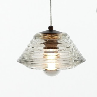
pressed glass pendants - 2009/2010
I love glass pendents; I particularly like these as they include imperfections in the glass.
Those imperfections would create a wonderful effect with the light.
tom dixon – www.tomdixon.net
copper shade 2005
Such great materials used in the collections, brass, glass, copper!

design museum - www.designmuseum.org/design/tom-dixon
Eurolounge Jack lights 1997
An oldie, but a goodie!

tom dixon – www.tomdixon.net
punch light
This light has been described as referencing a pleated lampshade.


The angled pieces of polished steel add a much more industrial element!

tom dixon – www.tomdixon.net
pipe pendant
A huge cluster of the black/gold pendants would look fantastic in a bar or restaurant!


design research studio - www.designresearchstudio.net/
(tom dixon is creative director of design research studio, a interiors and architectural practice)shoreditch house
I love the simplicity of the table, with those huge pendants above!


I was reading an interview with Tom Dixon on the the UK Design Museum website, and I found the response below really interesting. It reminds me of designers like Ray and Charles Eames, where exploration of materials and function come first. I wonder if that is why the designs stand the test of time!

Q. How would you describe the way you work?

A. Some days I work as a designer, but the bits that really interest me are the invention, engineering and marketing rather than the actual process of designing. I think that effective designers tend to be interested in the whole chain. Robin Day, Verner Panton and all those people really felt that they were going to change everything through design. It’s a very humbling way to look at it. I think designers now are much more concerned about the shape of the object and their own personal evolution within it. And I think a good designer is somebody who manages to put together all the elements – an understanding of materials and a belief in improving functionality – then puts the shape on last as a result of all those experiments. I’m a designer very occasionally. I tend to be on the periphery, occasionally popping out a product which is designed mainly through an interest in materials and technologies.

Excerpt from interview - www.designmuseum.org/design/tom-dixon
tom dixon – www.tomdixon.net
blow lights
An energy saving light, designed to accommodate low-energy compact fluorescent light bulbs. Tom Dixon gave away 1000 in 2007 at the London Design Festival to promote the use of CFL's.

Sunday, March 15, 2009

i heart florence broadhurst

insideout sept/oct 2005
Floral Oriental is one of my all time favourite designs!


I couldn’t go very far into my blog without mentioning Florence Broadhurst! I have long had a love affair with her designs. Her wallpaper and fabric designs are timeless. I have several of the wallpaper samples on my inspiration board and I never tire of looking at them! And the Cranes in Sunspot cushion looks perfect on my lounge!

Used in the pop up store invite, this photo shows the diversity of Florence Broadhurst’s designs.

Late last year I went to launch of the Signature Prints pop up concept store in Brisbane and was lucky enough to hear Helen O’Neil read from her fascinating biography on Florence Broadhurst. Apart from loving her designs, you have to admire the flamboyant life she lived. She constantly reinvented herself, creating different identities and histories as she travelled around the world. And it all started from a cattle property in north-west Queensland!

A life by design – Florence Broadhurst in a magazine ad from the 60’s
After reading her biographies, I think this picture captures her personality perfectly!

I also find it inspiring that she started the wallpaper business at the start of her 60’s, proving you’re never too old! Our interiors would be so much more dull without her (and her creative team)!

The Cranes in many incarnations!

house and gardens website
Floral Oriental looks striking in this black & white scheme.


signature prints catalogue - http://www.signatureprints.com.au/
A few of my favourites!

An article in Vogue Living (Jan/Feb 2008) mentioned there were 530 designs in the Signature Prints library, with only 50 having been released to the public, can you imagine looking through them all!

emma hack - www.emmahackartist.com/wallpaper.php

And to end this post, an artwork by Emma Hack. I first saw her work on the front cover of the signature prints catalogue, it was so striking! I had to include my favourite from her wallpaper series, featuring The Cranes wallpaper.

Sunday, March 8, 2009

silence and twilight

I was flipping through the latest Vogue Living when I came across this house featured at the Sunshine Coast. I love it, especially the outdoor neon sign the owner has created – “silence and twilight”!

vogue living - mar/apr 2009

I love how text and typography can be so emotive in an interior, or in this case exterior. You can just imagine sitting out there at twilight – so quiet and beautiful.

You don’t need to spell out the whole word either, oversized zinc letters can make a great statement in an interior. All the more special if the letters have a meaning for the people living there!

Favourite words of mine include, habitat!, dream and hope, they evoke such great meanings for me. What are your favourite words?! I say pick a favourite and put it on your wall!

real living – christmas special 2008
I love the red oversized letters, and that it spells out the owners name!

the family at home – 2008
A great way to personalise a child’s room

the family at home – 2008
Another great option for a playroom!

real living
More red!

the start!

The first blog I read about a year ago was Habitually Chic. I love reading an insiders view into interiors in New York! Since then I've added a few other blogs to the must read list! After reading all these great blogs, I thought I'd add my design inspiration to the mix too! I hope you enjoy my possibly random postings on all things design!